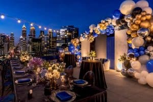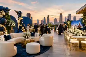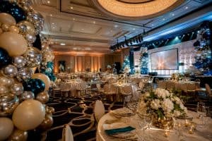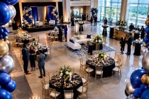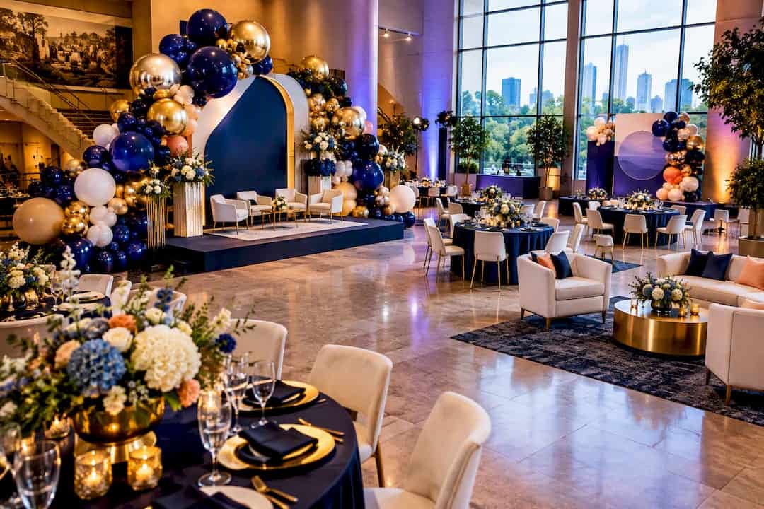
This guide hands you six ready-to-use corporate balloon palettes with exact hex codes, plus the matching workflow Atlantaballoondesigner uses to translate brand colors into balloon decor that photographs true and holds up under venue lighting. You’ll get finish guidance, contrast checks, and the sample-testing steps that stop a “close enough” color match from becoming a client complaint. An expert in balloon design walks through what actually works on-site, not just in theory.
TL;DR:
- Using exact brand hex codes ensures color consistency and true-to-brand representation in balloon installations, especially under venue lighting.
- Finishes like matte latex, metallic, pearl, and Mylar significantly alter color perception and must be selected based on brand personality and event context.
- Confirm color matches with physical samples, test them in the actual venue lighting, and verify contrast ratios for signage to avoid mismatches and unreadable branding.
- Shift palette intensity and accents seasonally and according to event type, using brighter shades for outdoor events and richer jewel tones for evening galas.
- Coordinating through a step-by-step workflow from brand brief to final install reduces the risk of costly reworks and guarantees color fidelity.
Table of Contents
- Building a Corporate Colors Balloon Palette That Matches Your Brand
- Six Corporate Balloon Palettes With Hex Codes
- How to Match Balloon Colors to Your Brand Hex Codes
- Finishes and Textures That Change How Corporate Colors Read
- What 2026 Color Trends Mean for Corporate Balloon Palettes
- Getting the Production Details Right on Site
- How Atlantaballoondesigner Curates Corporate Palettes
- Adapting Corporate Palettes by Season and Event Type
- Common Mistakes Corporate Planners Make With Balloon Colors
- A Balloon Designer’s Take on Brand Fidelity vs. Visual Impact
- Book Your Corporate Palette Consultation
- Sources
- FAQ
Building a Corporate Colors Balloon Palette That Matches Your Brand
A corporate colors balloon palette works when it starts with the brand’s exact hex values, not a designer’s best guess at “navy” or “gold.” About half of consumers say they’ve picked one brand over another based on color alone, according to Adobe’s research on color and branding, and blue consistently ranks as the color people trust most. That’s the whole argument for treating balloon color as a branding decision, not a decorating one. A business color balloon scheme built from real brand assets, tested in the actual venue, and finished with intention will outperform anything pulled from a generic party-store rack. The rest of this guide breaks down exactly how to build one.
Six Corporate Balloon Palettes With Hex Codes
These six palette samples cover the brand personalities most corporate planners are working with. Each pulls double duty: professional enough for a boardroom, striking enough for a step-and-repeat.
- Executive Navy & Gold — #1B2A4A, #C9A24B, #FFFFFF, #8C8C8C. Best for financial services, law firms, and legacy brands. Use chrome gold accents against matte navy for a boardroom-to-gala range. Photographs cleanly under warm stage lighting.
- Tech Innovator Blue — #0A2540, #2D9CDB, #FFFFFF, #D6E4F0. Suited to SaaS launches, fintech, and product reveals. Pearl finish on the light blue keeps it from reading flat under fluorescent convention lighting.
- Modern Minimalist Mono — #111111, #FFFFFF, #B0B0B0, #E5E5E5. Works for design agencies and architecture firms wanting a gallery feel. All-matte finish is non-negotiable here; any shine competes with the concept.
- Bold Startup Coral — #FF6B5E, #1B2A4A, #FFFFFF, #FFD166. A high-energy option for consumer brands and grand openings. Mix matte coral with a metallic gold accent column for contrast without visual noise.
- Wellness & Sustainability Sage — #7A8B6F, #D9C7A3, #FAF6F0, #4A5D45. Fits health brands, nonprofits, and ESG-forward companies. Matte and pearl finishes together read organic instead of corporate.
- Luxury Jewel Accent — #2C0735, #0B6E4F, #FAF6F0, #C9A24B. Built for award galas and VIP receptions. Chrome or Mylar finishes on the plum and jade make this palette read expensive under low light.
Each palette links back to a brand personality, and the finish choice does as much work as the hex code itself. A palette in the wrong finish can undercut the color entirely, which is exactly what the next section addresses.
How to Match Balloon Colors to Your Brand Hex Codes
Turning a brand style guide into a floor-ready palette takes more than eyeballing swatches. Here’s the process A typical process runs before any install:
- Pull the brand’s exact hex or RGB values from the client’s style guide, not their website screenshots, which shift color depending on the monitor.
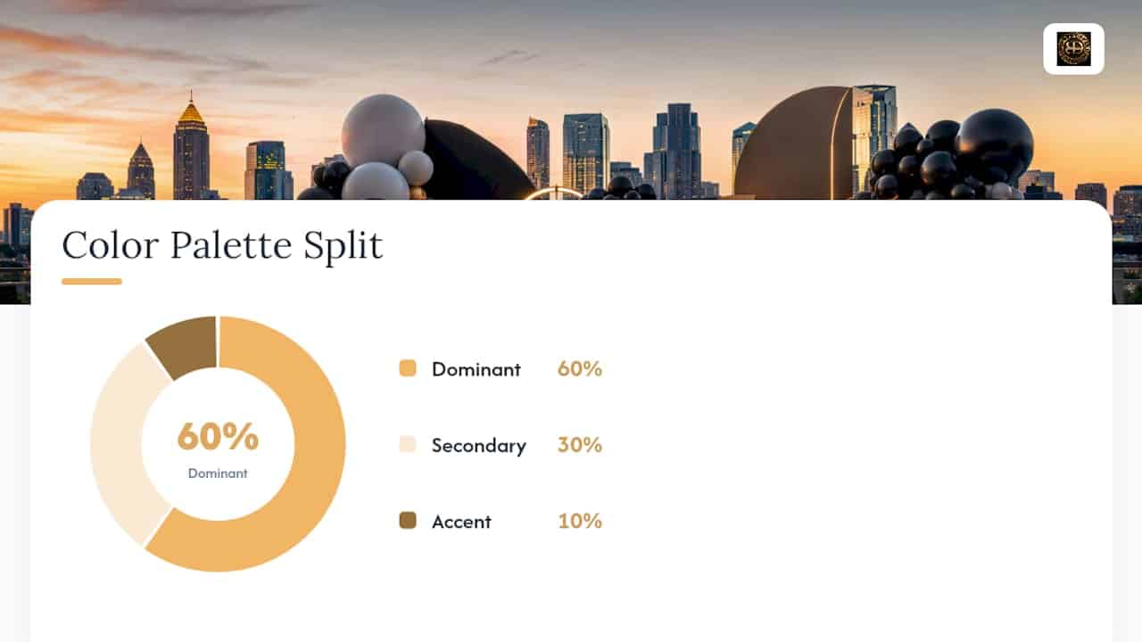
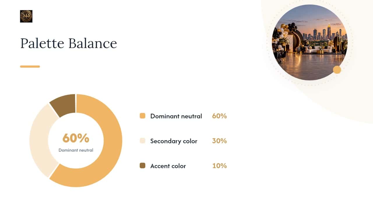
- Apply a 60/30/10 split across the installation: 60% dominant neutral or brand primary, 30% secondary brand color, 10% accent. This keeps large-format arches from overwhelming a room.
- Run the palette through Adobe Color’s harmony and contrast tools to generate complementary or analogous supporting tones and check WCAG contrast ratios for any signage or text overlaying the balloons.
- Order physical color chips or a small test batch in the target finish. A decorator’s guide to 2026 balloon trends notes that professional decorators routinely request manufacturer chips before committing to full production, since dye lots and finishes shift color more than swatch books suggest.
- Photograph the sample under the actual venue lighting, not daylight, before getting client sign-off. Warm ballroom lighting can pull a cool blue toward teal.
- Confirm quantities and finish codes with your vendor in writing before the order ships.
Pro Tip: Request your balloon vendor’s brand-specific color chart before finalizing a palette. Manufacturer colors don’t always match Pantone one-to-one, and catching that gap on a chip is far cheaper than catching it on install day.
Our own guide to choosing balloon colors that pop walks through color theory basics if you want the foundation before running this workflow.
Finishes and Textures That Change How Corporate Colors Read
Finish changes color perception as much as the hex code does. Matte latex absorbs light and reads as the truest, most saturated version of a color, which is why conservative brands (law firms, financial institutions) tend to stay all-matte. Metallic and chrome finishes reflect venue lighting and shift tone depending on the angle, giving jewel tones and gold accents a richer look but making pastels look muddier. Pearlescent finishes sit between the two, adding shimmer without full reflection, which works well for wellness and lifestyle brands. Mylar holds color longer and prints crisply for logo work, though it lacks the organic texture of latex.
- Matte latex: truest color, best for conservative or minimalist palettes.
- Metallic/chrome: reflective, best for accent columns and jewel tones, not full walls.
- Pearl: subtle shimmer, good middle ground for wellness or lifestyle brands.
- Mylar/foil: longest float time, sharp for printed logos, less texture depth.
Biodegradable latex breaks down faster after events, while Mylar can be deflated, stored, and reused for recurring brand activations. One planning note worth building into every proposal: balloon installations built for corporate events increasingly favor printed Mylar specifically because it holds float longer through multi-day conferences, reducing the need for touch-up visits.
What 2026 Color Trends Mean for Corporate Balloon Palettes
Pantone’s 2026 color of the year, Cloud Dancer, is showing up as a neutral foundation rather than a full palette replacement, and that distinction matters for brand-critical events. Trend forecasters note that Cloud Dancer works best as an anchor tone, layered under brand colors instead of substituted for them. Corporate event design for 2026 is splitting into two directions: soft, serene neutrals on one side and bold jewel accents like Plum Noir and Jade on the other, with designers layering two to three trending tones over a neutral base rather than committing fully to either extreme.
- Use Cloud Dancer or soft ivory as your 60% base, then layer brand colors on top instead of replacing them.
- Add one jewel accent (Plum Noir, Jade, or deep emerald) at 10% for galas and VIP events.
- Skip full trend adoption for brands with strict style guides. Trends should support recognition, never override it.
- Mini-palette example: Cloud Dancer base + brand navy + a single jade accent column reads current without abandoning brand identity.
Getting the Production Details Right on Site
A gorgeous palette still fails if the signage is unreadable or the balloons deflate before doorbusters. Check text and logo contrast against balloon backgrounds using WCAG contrast guidelines, and avoid pairing light gray text on pastel balloons. Place your highest-impact brand colors at entrances and stage backdrops, since testing samples in actual venue lighting remains the most reliable way to confirm color accuracy before full production.
- Check contrast ratios for any text or logos placed over balloon backdrops.
- Reserve primary brand colors for entrances, stages, and step-and-repeat zones.
- Plan float time by balloon type: latex typically holds 8 to 12 hours, while treated or Mylar options last multiple days.
- Shoot test photos with flash off to catch true color and avoid glare on chrome finishes.
Pro Tip: Schedule your install with at least two hours of buffer before doors open. Chrome and metallic finishes need time to settle without fingerprints or static cling before the first photo gets taken.
How Atlantaballoondesigner Curates Corporate Palettes
Palette curation at Atlantaballoondesigner follows a consistent flow: brand brief and hex values first, digital mockup second, on-site color sample third, final install last. That sequence exists because catching a color mismatch on a mockup costs nothing. Catching it after installation costs a reinstall.
- Brand brief: Client shares logo files, style guide, and event goals.
- Digital mockup: A rendered preview shows the palette against the actual venue layout before ordering.
- On-site sample: A physical color chip or test cluster gets photographed in the room’s real lighting.
- Final install: Full-scale execution, from organic balloon arches to marquee letters and tablescapes, built around the approved palette.
This process is applied in various large-scale event activations and gala installs throughout the Atlanta metro area, with the same brand-first workflow used whether the project is a lobby arch or a full ballroom transformation.
Adapting Corporate Palettes by Season and Event Type
A single corporate colors balloon palette rarely stays static year-round, and it shouldn’t. A tech company’s spring product launch and its winter holiday party both need brand recognition, but the seasonal context changes what reads as appropriate.
Spring and summer corporate events lean into brighter, more saturated versions of brand colors, since natural light amplifies both pastels and jewel tones outdoors. A brand built on navy and gold might swap in a lighter periwinkle accent for a Q2 outdoor client appreciation event while keeping the core navy and gold intact for recognition.
Fall conferences and galas tend to favor deeper, richer executions: jewel tones, chrome accents, and warmer metallics that hold up under evening lighting. Winter holiday activations often layer a brand’s core colors with seasonal neutrals like Cloud Dancer or warm ivory, letting the brand colors serve as accents against a softer base rather than dominating the room.
Event type matters just as much as season. A product launch calls for bold, saturated brand colors that photograph well for press and social media. An investor dinner or board reception calls for restraint: matte finishes, a tighter palette, and accent colors used sparingly rather than as focal points. A trade show booth needs colors that read clearly from a distance across a crowded floor, which usually means higher contrast between the dominant and accent tones than an intimate reception would use.
The rule of thumb: keep the brand’s primary hex values constant across every season and event type, and let the neutral base, accent ratio, and finish choice shift to match the occasion.
Common Mistakes Corporate Planners Make With Balloon Colors
The most frequent error is matching color from a screen instead of a physical sample. Monitors, printers, and phone cameras all render hex codes differently, and a brand blue that looks accurate on a laptop can shift noticeably once it’s translated into latex or Mylar under venue lighting. Skipping the physical sample step is how mismatches make it all the way to install day.
A second common mistake is overloading the palette. Corporate brand guides often include five or six approved colors, but using all of them at equal weight in a single installation creates visual noise instead of brand clarity. The 60/30/10 ratio exists specifically to prevent this. Pick a dominant neutral, a clear secondary color, and one accent, rather than treating every brand color as equally important in the same arch.
Ignoring finish is another overlooked pitfall. A brand color that reads as sophisticated in matte can look cheap in the wrong metallic sheen, and vice versa. Planners sometimes lock in a hex code without ever discussing finish with their vendor, then get surprised by how different the final product looks from the mockup.
Finally, plenty of planners skip contrast testing entirely, which becomes a real problem the moment signage, logos, or step-and-repeat text gets placed against a balloon backdrop. Low-contrast pairings look elegant in theory and become unreadable in event photography. Testing contrast before production, not during setup, avoids a scramble to swap materials hours before doors open.
A Balloon Designer’s Take on Brand Fidelity vs. Visual Impact
Here’s the trade-off nobody puts in the brand guide: matching a hex code exactly sometimes makes an installation look flatter in person than a slightly warmer or cooler variation would. My rule of thumb is simple. Stay locked to brand color for anything logo-adjacent, and give yourself a shade of flexibility on accent tones only after a client has approved a physical sample, not a screen mockup.
— Kay
Book Your Corporate Palette Consultation
Atlantaballoondesigner is the alternative to guessing your way through a color match. We build the digital mockup, order the physical sample, and photograph it in real lighting before a single balloon gets inflated for your event, so what you approve is what actually shows up on install day. Our Digital Mockup Services run $75 per mockup, letting you preview a palette against your venue before committing to full production, and Site Visits are available for $250 when you need eyes on the room ahead of a major activation.
Full installs like our Organic Balloon Arch start from $700, and Big Letters for stage branding or marquee moments start at $50 per letter. We serve corporate clients across Atlanta and within a 60-mile radius, from downtown convention centers to Marietta boardrooms, with turnaround built around your event date, not ours. Reach out through our pricing and booking page to request a quote and get your brand’s palette on the calendar.
Sources
Before finalizing any corporate colors balloon palette, run it through a few trusted checks. Adobe Color extracts base colors, builds harmonies, and tests WCAG contrast ratios. Canva’s balloon color palette wiki offers pre-built combinations for quick reference. For broader event context, Wild Foodz’s guide to hospitality trends covers how food styling and color coordination work together at upscale events.
- A comprehensive guide to using color in branding | Adobe Express
- How to make a custom color palette with Adobe Express.
- Balloon Decor Trends 2026: Colors, Seasons & Creative Inspiration – Gemar
- Corporate event design in 2026: the trends redefining decor and aesthetics – The Idea Hunter
FAQ
What are some good corporate balloon color combinations?
Navy and gold, monochromatic gray and white, and sage with cream are reliable combinations for corporate branding. Each pairs a neutral base with one or two brand-accurate accent colors, following the 60/30/10 ratio covered above for balanced, photo-ready results.
What is a good color palette for a corporate presentation?
A strong presentation palette uses one dominant neutral, one brand primary color, and a single accent, mirroring the same ratio used for balloon installations. Blue remains the most trusted color choice for corporate contexts, according to Adobe’s branding research.
What are the balloon trends for 2026?
White and neutral foundations like Cloud Dancer are leading, layered with jewel accents such as Plum Noir and Jade, according to 2026 balloon decor trend coverage. Mixed finishes, combining matte with metallic or chrome accents, are also a defining feature of the year’s corporate installations.
What are some professional corporate colors?
Navy, charcoal gray, white, and metallic gold are the most common professional corporate colors, often paired with one brand-specific accent like blue, sage, or jewel tones. The right choice always depends on the brand’s actual hex values rather than generic “corporate” assumptions.
How much does a corporate balloon installation cost?
Pricing depends on scale and service. An Organic Balloon Arch starts from $700, a Luxury Organic Balloon Arch starts from 1000 $ one-off, and delivery, setup, and strike down fees start from $125.