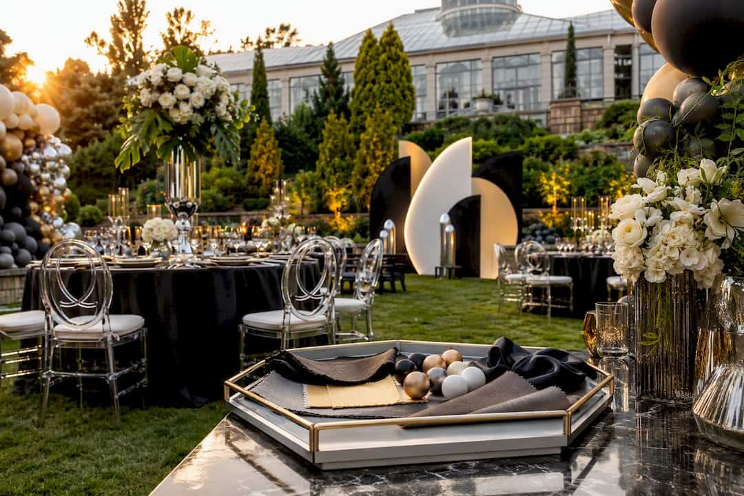
An event mood board is a focused visual brief that captures color, lighting, texture, and tone so clients and vendors interpret the same vision the same way. It works because it turns “elegant and romantic” into hex codes, fabric swatches, and lighting cues nobody has to guess about. The single best first move: build one annotated page that nails down your palette, your lighting direction, and the two or three focal moments that matter most, before you touch a vendor contract.
TL;DR:
- An effective event mood board should include a locked color palette with hex or Pantone codes, texture references, lighting notes, and prioritize must-have design elements.
- Building separate client and vendor versions enhances clarity, with the former being aspirational and the latter technical, measurements, and specifications.
- Curate inspiration images down to 20-30 with clear core elements, ensuring they are feasible within the budget and venue constraints from the outset.
- Annotate each zone of the board with specific measurements and logistics, and run it against venue and budget realities before vendor approval.
- Using templates, swatch packs, and detailed technical notes maximizes speed, accuracy, and reduces errors during setup and execution.
Table of Contents
- What Is an Event Mood Board, and What Should It Actually Do?
- When and Why to Use Mood Boards in Your Event Workflow
- How to Build an Event Mood Board, Step by Step
- Tools, Templates, and File Formats That Actually Work for Vendors
- Turning the Board Into a Working Document Vendors Can Execute
- Mistakes That Turn a Good Mood Board Into a Production Headache
- How Atlanta Balloon Designer Turns a Mood Board Into a Build
- Why Mood Boards Still Beat Jumping Straight to Renders
- Ready to Turn Your Mood Board Into a Real Installation?
- Sources
- FAQ
What Is an Event Mood Board, and What Should It Actually Do?
An event mood board earns its place in your workflow the moment it stops a client from saying “that’s not what I pictured” three weeks before the event. It is a curated set of images, colors, and notes that answers one question for everyone involved: what does this event look and feel like?
Three jobs matter most. First, it’s a client briefing tool that turns vague adjectives like “luxurious” or “whimsical” into something you can point at. Second, it’s a vendor brief that tells your florist, lighting tech, and balloon designer exactly what materials, tones, and finishes to source. Third, it’s an internal alignment document that keeps your own team, and anyone subcontracted for the day, working from the same reference instead of five different mental images.
A board worth handing off includes:
- A locked color palette with hex or Pantone codes, not just “gold and ivory”
- Texture and material references, photographed close enough to show grain, sheen, or weave
- Lighting direction notes (warm uplighting, candle glow, chandelier sparkle)
- A prioritized list of which elements are must-haves versus nice-to-haves
- “Feel” words that anchor the tone (romantic, bold, editorial, playful)
Timing matters as much as content. Build your first draft during the discovery call, right after budget and guest count are set, then refine it once the venue is confirmed. A board built before venue selection risks recommending finishes the space can’t support. According to Canva’s guide to mood boards, the strongest boards pair a color palette with texture references and lighting direction so vendors read tone the same way a client does.
When and Why to Use Mood Boards in Your Event Workflow
Not every mood board is created for the same audience, and that’s where a lot of planners lose time. A concept board is aspirational. It’s built to sell a vision, get client buy-in, and set emotional direction before anyone commits money. A production board is technical. It carries measurements, material specs, and vendor-ready notes that a crew can execute without calling you six times on setup day.
Here’s how the two typically play out across a project:
- Concept board first — shared with the client and any sponsors during the pitch or discovery phase, focused on mood, color, and inspiration imagery.
- Production board second — built after concept sign-off, shared with vendors and crew, focused on dimensions, materials, and install logistics.
- Hybrid check-in board — a lighter version used mid-project when details shift (new venue room, changed guest count) and you need fast realignment without rebuilding everything.
The payoff is speed. A client who has already approved a concept board rarely reopens color or theme debates during vendor negotiations, which shortens approval cycles and keeps everyone, from florists to lighting crews, working off one visual standard instead of competing interpretations.
How to Build an Event Mood Board, Step by Step
This is the part that actually gets used on the day of setup, so treat it as a workflow, not a mood exercise. Each step below builds toward one deliverable: a board a vendor can execute without a follow-up phone call.
Step 1: Clarify the Brief
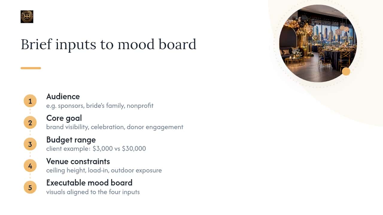
Before you open Pinterest or Canva, write down four things: who the audience is (corporate sponsors, a bride’s family, a nonprofit gala committee), what the core goal is (brand visibility, milestone celebration, donor engagement), the budget range, and any venue constraints already known (ceiling height, load-in access, outdoor exposure). Skipping this step is the number one reason boards drift into pure fantasy. A gorgeous board built for a $3,000 budget when the client actually has $30,000, or vice versa, wastes everyone’s time.
Step 2: Gather Inspiration Without Drowning in It
Pull references from magazines, runway photography, past events you’ve styled, and yes, Pinterest and Instagram. The temptation is to save everything remotely pretty. Resist it. Adobe’s guide to mood boards recommends curating down to roughly 20 to 30 images, because past that point clients stop absorbing detail and start scrolling on autopilot. Fewer, sharper images communicate a stronger point of view than a sprawling collage ever will.
Step 3: Extract and Record the Core Elements
This is where inspiration turns into a working document. For every image you keep, pull out:
- The exact color palette, recorded as hex or Pantone codes, not adjectives
- Material and texture references (velvet, chrome, raw linen, matte versus glossy latex)
- Lighting direction and color temperature (warm amber uplighting versus cool white spotlighting)
- Scale notes (an 8-foot arch reads differently than a 14-foot one in a ballroom with 20-foot ceilings)
- The two or three focal moments the whole design should build toward, like a step-and-repeat entry or a head-table backdrop
Canva’s guidance is specific here: a palette, textures, lighting direction, and a handful of “feel” words are what let a vendor read tone without you in the room to translate it.
Step 4: Arrange and Annotate by Experience Zone
Rather than dumping every image onto one page, organize by the parts of the event a guest actually walks through such as entry, main moment, lounge, food and beverage, and exit. Milanote’s step-by-step guide points out that grouping visuals by experience zone makes budget allocation and vendor briefs far clearer, because you’re no longer trying to describe the whole event in one undifferentiated image grid. Annotate each zone with a short production note: “entry arch, 10 feet wide, organic garland style, anchor points confirmed with venue.”
Step 5: Produce Stakeholder-Specific Versions
One board rarely serves both the client and the crew well. Build two:
- Client-facing board: polished, aspirational, image-forward, light on technical jargon
- Production-facing board: annotated with measurements, material specs, and priority rankings, built for the people actually installing the work
This split matters more than most planners realize early in their careers. A client doesn’t need to see rigging tolerances. A rigger doesn’t need romantic language about “ethereal ambiance.” Give each audience what moves their part of the project forward.
Step 6: Reality-Check Against Budget, Venue, and Time
Before you send anything to a vendor, run the board against three filters: does the budget bracket actually cover these finishes, does the venue physically support this scale and lighting plan, and does the setup and strike window leave enough time to execute it safely. According to Eventkit’s guidance on strategic mood boards, the boards that hold up under vendor negotiation are the ones tied to real budget and logistics constraints from the start, not aspirational collages assembled without those guardrails.
Step 7: Archive Templates and Swatch Packs
Once a board is approved and the event executes, don’t let it die in a folder. Save the palette codes, the material swatch pack, and the zone-based layout as a reusable template.
Pro Tip: Label every image “inspiration only” or “must replicate” directly on the board. That one habit prevents more scope-creep arguments than any contract clause, because it tells a client upfront which images are just mood and which ones you’re actually committing to build.
Tools, Templates, and File Formats That Actually Work for Vendors
Digital boards win for speed, easy revision, and remote client approval, which covers most modern event timelines. Physical boards, foam-mounted printouts with fabric swatches taped on, still earn their place for luxury clients who want to hold materials in hand, or for in-person vendor walkthroughs where a laptop screen feels too casual for the moment.
Keep three template types on file so you’re never starting from zero:
- A single-page client board for pitch meetings and quick approvals
- A multi-panel production board, organized by experience zone, with measurements and material notes
- A swatch pack, either physical fabric and ribbon samples or high-resolution close-up photos, that travels with the production board
For sharing with vendors, export as a PDF with embedded swatches so nothing gets lost in translation across email chains. Pair it with high-resolution image assets for anyone printing signage or backdrops, and keep an editable link (Canva, Milanote, or a shared drive folder) live for the production team in case last-minute swaps are needed. Whatever platform you use, never send a board without hex or Pantone codes attached and at least one close-up photo of the actual material, not just a styled lifestyle shot. Vendors price and source differently when they can see texture, not just color.
Turning the Board Into a Working Document Vendors Can Execute
A mood board that never leaves the “pretty reference” stage isn’t doing its job. Vendors need annotations that tell them exactly what to build, where, and how it attaches.
Every production board handed to a vendor should carry:
- Measurements for every structural element (arch width, backdrop height, table runner length)
- Mounting points and anchor locations confirmed with the venue in advance
- Material specifications (latex finish, fabric weight, floral variety) with tolerance notes where color matching matters
- Lead times for sourcing and production, plus an on-site contact name and phone number
- Setup and strike windows, confirmed against the venue’s own load-in schedule
Version control prevents the most expensive kind of miscommunication: someone building off an outdated draft. Set two hard checkpoints, a client sign-off on the concept board and a separate production sign-off on the technical board, and date-stamp every revision so nobody executes from a file that’s three versions behind.
When you walk a vendor through the board in person, present zone by zone rather than flipping through every image at once. Milanote’s guidance on organizing by experience zone applies just as well in the meeting room as it does on the page. Talking through the entry, then the main moment, then the lounge, keeps a vendor’s questions specific to what they’re actually responsible for building, instead of a scattered conversation about the whole event at once.
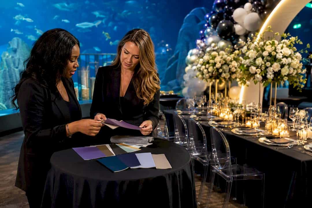
Pro Tip: Bring printed swatch cards to vendor walkthroughs, even if your board is fully digital. Screens shift color temperature depending on lighting, and a florist or fabricator quoting off a washed-out laptop screen is a common, avoidable source of finish mismatches.
Mistakes That Turn a Good Mood Board Into a Production Headache
The most common failure is building a board that’s gorgeous but unbuildable. Aspirational images with no feasibility notes lead clients to fall in love with finishes that blow the budget or exceed the venue’s physical limits. The fix is simple: attach a rough cost range and a feasibility note directly to every high-impact image.
A close second is trying to please everyone with too many styles crammed onto one board. A mood board with five competing aesthetics gives vendors nothing solid to execute against. Limit yourself to three core design pillars and cut anything that doesn’t reinforce them, even if it’s a beautiful image on its own.
Missing technical specs is the mistake that shows up hardest on setup day. A board full of inspiration photos but no dimensions or material notes forces a crew to guess, and guessing at load-in time costs money. Add a dedicated production panel with measurements and swatches before the board ever leaves your hands.
Finally, watch for boards that ignore the venue and budget entirely. A ballroom with low ceilings can’t support the eight-foot floral chandelier from your Pinterest board, no matter how much a client loves it. Include venue photos alongside inspiration images so the comparison is visual, not just a conversation you’re having verbally after the fact.
How Atlanta Balloon Designer Turns a Mood Board Into a Build
Balloon installations carry technical demands most mood boards never account for, which is exactly where a specialist earns their fee. Our team annotates every board with anchor points confirmed against the venue’s actual structure, latex finish and texture references so color-matching happens before production day, and weather notes for any outdoor install where wind load changes rigging decisions entirely.
Site visits and digital mockup services fill the gap between a pretty reference image and a buildable plan. A typical visit checks clearance for an arch or backdrop, confirms electrical access for any lit elements, and locks in setup and strike timing against the venue’s own schedule, the same checkpoints we’d expect any serious vendor to confirm before quoting a job.
The deliverable list we hand off to our own crews and to venue staff usually includes a supply list broken down by color and finish, rigging notes specific to that ceiling height or anchor style, and photo references pulled straight from the approved production board. Planners referencing our creative balloon decoration ideas often find those visuals translate directly into board-ready inspiration images, already scaled to real installations rather than styled photo shoots.
Why Mood Boards Still Beat Jumping Straight to Renders
Mood boards win on speed and cost, and that’s not a small advantage. A one-page board can align a client and a vendor in a single meeting, while a 3D render often takes days and real budget to produce, which makes it the wrong tool for early-stage alignment. Save rendering for the handful of elements where the financial or visibility risk actually justifies it, a sponsor-branded main stage backdrop, say, not a lounge vignette nobody will scrutinize.
The workflow that holds up under pressure keeps the mood board as the single source of truth throughout, even after a render exists. Renders answer “does this specific structure work,” while the board still answers “does the whole event feel right together,” and one rarely replaces the other cleanly.
— Kay
Ready to Turn Your Mood Board Into a Real Installation?
Atlanta Balloon Designer is the direct alternative to guessing your way through vendor coordination after the board is approved. Instead of handing your palette and inspiration images to a general decor rental company and hoping they interpret your annotations correctly, you work with a team that builds custom balloon installations from that exact board, matched to hex codes, scaled to your venue, and installed with rigging that accounts for ceiling height and weather.
If your board calls for an arch, a garland, or marquee letters, our Digital Mockup Service turns your production panel into a rendered preview for $75 per mockup, so you approve the exact look before anything gets built. Full balloon decor pricing starts with a Spiral Balloon Arch from $600, and a Luxury Organic Balloon Arch from $1,000, with delivery, setup, and strike handled from $125. For larger corporate activations or milestone events where sponsor visibility or scale raises the stakes, a specialist site visit at $250 confirms clearance, anchor points, and electrical access before installation day. Request a mockup or book a site visit through our pricing page and bring your mood board with you. We’ll turn it into a build list the same week.
Sources
For planners building their own template library, Adobe’s guide to mood boards covers curated image selection and core visual elements in more depth than most quick-start guides. Canva’s mood board walkthrough is a solid reference for palette, texture, and lighting fundamentals if you’re new to building boards from scratch. Milanote’s step-by-step guide is worth revisiting whenever a project’s experience zones get complicated. For lighting decisions specifically, this guide on art lighting and room mood breaks down how lighting temperature and placement shift a space’s feel, a useful companion when you’re annotating the lighting direction section of your own board.
- The ultimate guide to mood boards
- How to create a mood board
- How to Make a Moodboard: Step-By-Step Guide
- How to Make Your Event Mood Board Strategic—Not Just Pretty
FAQ
How Do You Create a Mood Board for an Event?
Gather 20 to 30 curated inspiration images, extract a color palette with hex or Pantone codes, note textures and lighting direction, then organize everything by experience zone (entry, main moment, lounge) before annotating each section for vendors.
What Should a Good Event Mood Board Include?
A strong board includes a locked color palette with codes, texture and material references, lighting direction, a prioritized list of must-have elements, and a few guiding “feel” words that set the tone.
Can AI Tools Like ChatGPT Help Build a Mood Board?
AI tools can help brainstorm theme language, color combinations, and “feel” words quickly, but they can’t source real material swatches or confirm venue-specific feasibility, so treat AI output as a starting point rather than a finished board.
What Should Never Appear on an Event Mood Board?
Unlabeled aspirational images with no feasibility notes are the biggest risk, since a client may assume every image is a guaranteed deliverable rather than pure inspiration. Label anything not confirmed as “inspiration only” to avoid scope creep.
Do I Need Different Mood Boards for Clients and Vendors?
Yes. A client-facing board should stay polished and aspirational, while a production-facing board needs measurements, material specs, and annotations a vendor like Atlanta Balloon Designer can build from directly.