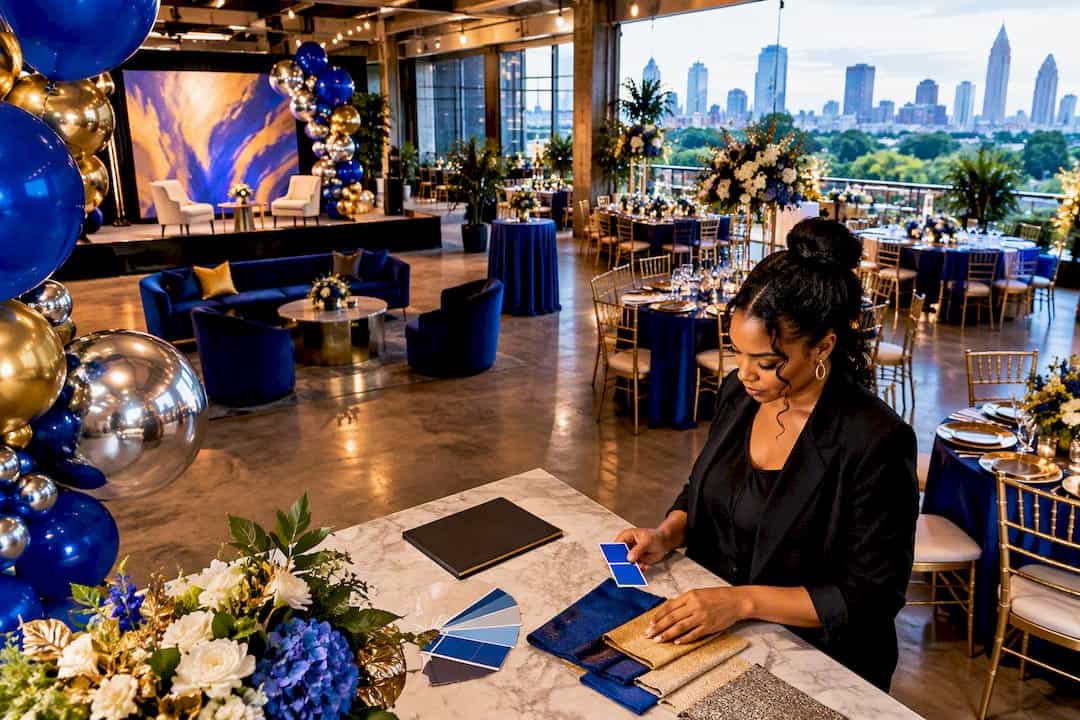
The fastest, most reliable way to get colors right at any event is a three-step workflow: define your anchor colors, choose a supporting palette, then test everything across every material and lighting scenario before install day. Skipping that last step is where most color disasters happen, because a hex code on a laptop screen and a latex balloon under warm venue lighting rarely match without a physical proof to confirm it.
TL;DR:
- Physical proof and lighting tests are essential to ensure color accuracy across materials, as digital hex codes often do not match real-world outputs.
- Building a color palette from approved brand sources and locking it early helps prevent costly mismatches or rework on event day.
- Use contrast ratios of at least 4.5:1 for text and key signage, and avoid relying on color alone to communicate important information to all guests.
- Latex balloon colors tend to desaturate and soften under venue lighting, making sample approval in situ crucial before full ordering.
- A comprehensive workflow includes digital mockups, physical swatch approvals, site lighting checks, and in-event verification to achieve consistent, brand-accurate event colors.
Table of Contents
- Step-by-step workflow for matching brand colors to an event
- Color theory essentials every planner needs
- Practical palette examples and combinations for event use
- How materials and production change color
- Accessibility and legibility: applying WCAG guidance for events and signage
- Tools, swatches and testing workflow
- Event rollout checklist: approvals, mockups, and on-site color QA
- How Atlanta Balloon Designer matches brand color across event elements
- Author perspective: color as brand storytelling for events
- How Atlanta Balloon Designer can help
- Primary sources and tools for further reading and testing
- Sources
- FAQ
Step-by-step workflow for matching brand colors to an event
Getting color right at an event is not a guessing game. It is a sequence, and each step protects the one before it.
- Pull your anchor colors straight from the source. Your brand style guide or logo file should give you hex codes, PMS numbers, and any approved variations. If a client cannot produce these, extract them from a high-resolution logo using a color picker tool rather than eyeballing a screenshot.
- Build a supporting palette around those anchors. Two or three secondary colors should carry the mood, create visual hierarchy, and photograph well under flash and stage lighting. A gala might pair a navy anchor with warm gold and a soft cream; a product launch might pair a brand blue with a punchy citrus accent for energy.
- Assign color roles to every surface. Decide which token owns the backdrop, which owns signage, which owns small accents like ribbon or candle glass, and which is reserved for sponsor logos that cannot be altered.
- Translate every token into media-specific references. A hex code means little to a balloon vendor or a paint supplier. Request Pantone matches for print, vinyl manufacturer codes for signage, paint or RAL equivalents for painted surfaces, and latex balloon samples for décor, then require a proof for each before approving production.
- Set approval gates tied to your production timeline. Lock the palette at the creative brief stage, approve digital mockups next, then approve physical swatches at least two weeks before install so there is time to reorder if something is off.
Brand managers often assume a locked hex code guarantees consistency. It does not, because printers, painters, and balloon suppliers work from entirely different color systems. The workflow above exists specifically to catch that gap before it becomes a $700 rebuild the morning of the event. For planners documenting this process repeatedly, an event decor style guide built once and reused across events saves real time on every future brief.
Color theory essentials every planner needs
You do not need a design degree to make smart color decisions, but three concepts will save you from expensive guesswork: hue, value, and saturation.
Hue is the color itself, red, teal, gold. Value is how light or dark that color is. Saturation, sometimes called chroma, is how intense or muted it appears. Of the three, value matters most for anything a guest needs to read from a distance. A logo in pale yellow on white looks elegant on a screen and disappears entirely on a printed banner or a stage backdrop under bright lighting. When legibility is the goal, prioritize value contrast between your text and background before you worry about which hues you are using.
Harmony rules give you a shortcut for building palettes that feel intentional rather than random. Resources like the Interaction Design Foundation’s color theory overview break these down in more depth, but three patterns cover most event needs:
- Monochrome uses a single hue in different values, ideal for a minimalist corporate stage or a sophisticated all-white gala with texture doing the visual work.
- Analogous pairs neighboring hues on the color wheel, such as teal, blue, and violet, for a cohesive look that still has depth.
- Complementary pairs opposite hues, like navy and gold or deep green and blush, for the kind of contrast that reads well in photographs and makes a step-and-repeat backdrop pop.
Reach for complementary schemes when photography and sponsor visibility matter most. Reach for analogous or monochrome schemes when the goal is atmosphere over impact, like an intimate baby shower or a quiet networking reception. Either way, value contrast between your focal elements and their background should win over hue choice every time legibility is on the line.
Practical palette examples and combinations for event use
Some palettes simply carry their weight better at scale, under stage lighting, and in photographs. These combinations work across a wide range of event types and give planners a fast starting point.
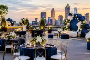
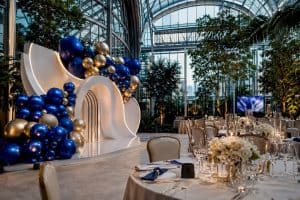
- Elevated gala: Deep navy anchor, warm gold accent, soft cream backdrop. This reads formal on a stage, holds up under warm lighting, and photographs beautifully against dark table linens.
- Tech conference: Slate gray anchor, teal secondary, a single hit of orange for calls to action. The neutral base keeps sponsor logos legible while the orange draws the eye to signage and booth numbers.
- Luxury baby shower: Sage green and dusty rose with a chrome or champagne metallic accent. Soft, photogenic, and flexible for either a boy or girl reveal without leaning on the traditional blue or pink.
- Corporate grand opening: Brand primary color as the anchor, white or light gray as a neutral field, and a metallic accent like brushed gold or chrome for balloon garlands and marquee letters.
- Milestone birthday: A jewel tone anchor such as emerald or sapphire, paired with black and a single metallic, gives an adult birthday a lounge feel rather than a kids-party feel.
- Retirement or anniversary celebration: Burgundy and blush with warm ivory, a combination that feels celebratory without skewing young or trendy.
- Fashion show or brand activation: High-contrast black and white with one saturated brand color reserved entirely for the runway backdrop, so the color becomes the visual signature of the event.
Sponsor logos and brand marks need enough contrast against their background to stay legible in every photo the event produces, which is exactly why palettes built around a neutral field with one or two saturated accents tend to outperform busier combinations on signage. Metallics like chrome, gold, and champagne work best as accents rather than dominant colors, since large metallic surfaces can create glare under stage lighting and shift how the true brand color reads on camera. Neutrals earn their place as the backdrop or tablecloth base precisely because they let the brand colors do the talking without competing for attention.
How materials and production change color
The same hex code will look like three different colors once it leaves the screen, because print, vinyl, paint, and balloon latex all handle light differently. Ink absorbs light in a way that reads truer to a digital proof. Vinyl has a slight sheen that can brighten a color. Paint dries slightly darker than it appears on the swatch card. Latex balloons refract and reflect light across a curved, semi-transparent surface, which tends to soften and slightly desaturate a saturated brand color compared with how it looks printed.
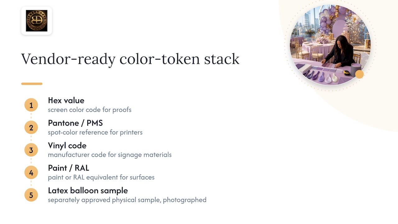
That is why a single hex code is never enough to hand a vendor. A complete color-token stack includes the hex value, the Pantone or PMS number, a vinyl manufacturer code for signage, and a paint or RAL equivalent for any painted surface, with a latex balloon sample requested separately for décor elements. Each vendor should return a proof mapped to those tokens rather than their own best guess at a match.
Pro Tip: Always approve a physical swatch for any surface larger than a table centerpiece. A screen preview cannot show you how a color behaves under your venue’s actual lighting.
For a saturated brand accent that has to hold its exact tone, request a balloon sample in the closest latex match to your PMS number and photograph it under the venue’s own lighting before signing off. A guide to choosing balloon colors that pop walks through how finish and light interact with latex specifically.
Accessibility and legibility: applying WCAG guidance for events and signage
Color choices that look sophisticated in a mood board can become genuinely hard to read once they are printed on signage or projected on a screen, and that is a design failure, not a taste problem.
The rule that matters most: WCAG 2.2 sets a minimum contrast ratio of 4.5:1 for normal text and 3:1 for large text or non-text elements, which covers everything from a program schedule to a directional sign at a conference. Logotypes, meaning text that is part of a logo design, are exempt from this rule, so a stylized brand mark does not need to hit the same ratio as body copy.
A few practical rules follow directly from that standard:
- Never rely on color alone to communicate something important, since roughly 1 in 12 men has some form of color vision deficiency; pair color-coded wristbands or signage with shapes, icons, or text labels.
- Test contrast using an actual tool rather than eyeballing it, since ratios must not be rounded up when a design sits right on the edge of passing according to guidance from the Access Board.
- Recheck contrast whenever text sits over a photo, gradient, or textured backdrop, since busy backgrounds are where legibility quietly fails even when the flat colors passed on their own.
- Document every pass and fail in your style guide with the actual measured ratio, not just a note that it “looked fine” in the room.
Building this check into your creative approval process, the same way you would approve a seating chart, catches problems while there is still time to swap a font weight or darken a background instead of discovering a sign is unreadable once it is already mounted.
Tools, swatches and testing workflow
Consistent color needs a repeatable process, not a good eye. The strongest workflows combine digital checks early and physical checks late.
On the digital side, use a contrast analyzer to check any text-over-background combination before it goes to print, an eyedropper tool to pull exact values from approved logo files, and a palette generator when you need to build out a secondary palette from a single anchor color. Some event platforms now build contrast warnings directly into their design tools, flagging a combination the moment it fails WCAG AA, which catches mistakes before a designer even finishes the mockup.
On the physical side, nothing replaces holding the actual material in your hands:
- Pantone chips for anything going to print, held under the same lighting the venue will use.
- Vinyl samples for signage and step-and-repeats, checked for sheen and glare.
- Printed proofs for any large-format piece, approved at full scale rather than on a shrunk preview.
- Balloon samples in the exact latex match, photographed under venue lighting before the full order ships.
- An in-venue check under both daylight and the room’s artificial lighting, since a color that reads true in a photo studio can shift noticeably under warm ballroom lighting.
Pro Tip: Keep every approved token in one living document rather than scattered across email threads. When a vendor asks for the brand blue six months later, you want one number, not three slightly different guesses.
An event decor style guide is the natural home for this record, and version-controlling it means the next event under the same brand starts from an approved baseline instead of from scratch.
Event rollout checklist: approvals, mockups, and on-site color QA
A color palette that looked perfect in the planning meeting can still go sideways on install day if nobody checks it under real conditions. Build these checkpoints into your production schedule and, where possible, your vendor contracts.
- Lock the palette at the creative brief stage, with hex, Pantone, and any known material tokens already attached.
- Approve a digital mockup showing the palette applied to the actual event layout, not a generic template.
- Require physical swatches for every large surface at least two weeks out, giving enough time to reorder a mismatched batch.
- Schedule an in-venue lighting test if the space allows a walkthrough before install day, checking how the palette reads under the room’s actual fixtures.
- Run a camera test on-site during setup, since a color that looks right to the eye can shift slightly through a phone or event photographer’s lens.
- Check daylight versus artificial light if the event spans both, since afternoon light through windows and evening uplighting can shift the same backdrop noticeably.
- Confirm signage placement and readability from the distance guests will actually stand, not from three feet away during setup.
Pro Tip: Keep one approved alternate accent color on file for every event. If a vendor’s balloon or vinyl stock runs short on the exact match, you want a pre-approved backup ready rather than a same-day scramble.
Building contingency into the contract, not just the mood board, is what separates a smooth install from a stressful one.
How Atlanta Balloon Designer matches brand color across event elements
Getting a brand’s exact color to survive the trip from a logo file to a 12-foot balloon arch takes a workflow, not luck. Atlanta Balloon Designer builds every custom installation around that discipline, starting with brief intake and ending with a photographed, lit installation that matches what the client approved on paper.
The process in practice looks like this:
- Brief intake captures the client’s hex codes, Pantone numbers, and any brand restrictions before a single balloon is ordered.
- Pantone-to-latex matching identifies the closest available latex color for each brand token, since not every PMS number has a perfect latex equivalent.
- Vendor sample review confirms sheen, finish, and true color before committing to a full order.
- Site visit lighting checks confirm how the approved palette will actually read in the specific venue, whether that is a Buckhead ballroom or an outdoor tented reception.
- Install and post-event photography document the finished result against the original brief for the client’s own records.
That workflow is why many corporate clients and event planners come back for repeat installations rather than treating color matching as a one-time gamble. Browse the balloon decor gallery for examples of palettes carried through from mockup to finished install.
Author perspective: color as brand storytelling for events
Most planners treat color as a decoration decision made near the end of the process. That is backward. Pantone’s own Color Institute has described color as a storytelling tool that connects emotionally with an audience, not a finishing touch, and that framing changes how a planner should brief a project from day one.
My advice for your next event: put your anchor colors in the creative brief before you book a single vendor. Every downstream decision, from florals to lighting gels to signage vinyl, gets faster and more consistent when the palette is locked before the sourcing starts instead of retrofitted around whatever happened to be available.
— Kay
How Atlanta Balloon Designer can help
If you want your brand colors to actually survive the trip from a style guide to a finished ballroom, that is exactly the work Atlanta Balloon Designer does every week.
Our team handles the full color-matching chain for you: palette curation that respects your brand guidelines, digital mockup services so you approve the look before anything is built, Pantone-to-balloon matching for accurate latex color, and in-person site visits to confirm how everything reads under your venue’s actual lighting. For corporate activations, grand openings, galas, and milestone celebrations across Atlanta and nearby communities within about 60 miles, we build custom installations, marquee letters, and full luxury styling around the colors your brand needs to show up correctly. If you are producing a ticketed or branded event, coordinating your visual palette across print and digital touchpoints, including platforms like Lookport’s custom branding tools, helps keep the same color story consistent from the invitation to the step-and-repeat.
Ready to see it on paper first? Request a digital mockup or check current balloon decor pricing to start planning your event’s palette with a team that gets the color right the first time.
Primary sources and tools for further reading and testing
- WCAG contrast guidance: the core accessibility rules behind text and signage contrast ratios.
- Access Board’s contrast standard: technical detail on measuring and testing contrast correctly.
- Pantone and event color storytelling: the Color Institute’s perspective on color as brand experience.
- Cvent’s accessible event color guidance: practical rules for applying WCAG standards to event materials.
Sources
- Ensure text and controls have enough color contrast (WCAG guidance)
- Contrast (Web) (Access Board)
- Q&A: How Pantone is helping brands elevate their events through color (BizBash)
- Using color in accessible ways for your event sites (Cvent Community)
FAQ
What is the fastest way to match brand colors for an event?
Start by pulling exact hex and Pantone values from the brand’s style guide, then build a supporting palette around those anchors before assigning colors to specific event surfaces. Testing physical swatches across every material, print, vinyl, paint, and balloon latex, before final approval prevents most mismatches on install day.
What contrast ratio should event signage meet?
WCAG guidance sets a minimum contrast ratio of 4.5:1 for normal text and 3:1 for large text or non-text graphic elements. Logotypes are exempt from this rule, so a stylized brand mark does not need to meet the same standard as body copy on a sign.
Why does my brand color look different on balloons than on my logo?
Latex balloons refract light across a curved surface, which tends to soften and slightly desaturate a saturated color compared with how it prints on paper or vinyl. Requesting a physical balloon sample in your closest Pantone match and reviewing it under your venue’s lighting before ordering avoids a color mismatch on the day of the event.
Can Atlanta Balloon Designer match our exact brand colors?
Yes, Atlanta Balloon Designer works from client-provided hex and Pantone values and matches them to the closest available latex color, confirming the result with vendor samples and site visit lighting checks before install. Digital mockups are also available so you can approve the palette before production begins.
Should I avoid using color alone to convey information at my event?
Yes, color should never be the only way you communicate something important, since a meaningful share of guests have some form of color vision deficiency. Pair color-coded elements like wristbands or signage with shapes, icons, or text labels so the information still comes through clearly.