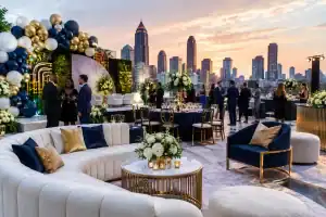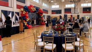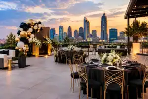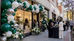
A new product can be brilliant and still disappear into a beige ballroom, an unbranded lobby, or a room with no reason to pull out a phone. This brand launch decor case study looks at how a strategic, design-forward installation can turn a corporate reveal into an experience guests feel the second they walk through the door.
The scenario is representative of the projects corporate teams bring to luxury event designers: a growing consumer-facing brand is introducing a bold new identity to employees, partners, media contacts, and VIP guests. The event has a tight timeline, a polished venue, and a clear mandate: make the launch look as confident as the brand wants to be perceived.
The Brand Launch Decor Case Study Brief
The launch was planned for an evening reception in Atlanta, with approximately 150 guests arriving in waves over two hours. The client wanted more than a logo moment. They needed a visual environment that could carry the energy of the rebrand from check-in through the reveal, networking, content capture, and closing remarks.
Their goals were specific. First, establish immediate brand recognition using the new color palette without making the room feel like a trade show booth. Second, create at least one high-impact photo opportunity that guests and media attendees would genuinely want to use. Third, support the event program without blocking sightlines, crowd flow, catering access, or the stage.
That last point matters. Great event decor is not just decoration. It is environmental design. A jaw-dropping balloon installation that interrupts the registration line or creates a bottleneck near the bar can work against the guest experience. The best work photographs beautifully because it also works beautifully in the room.
The Creative Direction: Bold, Branded, and Built for the Camera
The visual concept centered on the brand’s fresh palette: saturated cobalt, crisp white, chrome silver, and a sharp accent of electric orange. Rather than using every color at equal volume, the design treated cobalt as the anchor, white as visual breathing room, chrome as the luxury finish, and orange as the punch of energy.
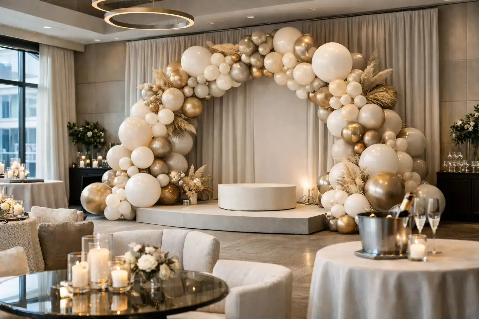
The hero piece was an organic balloon installation built around a customized photo backdrop at the venue entrance. It was designed with varying balloon sizes, sculptural movement, and carefully placed chrome elements to create depth under event lighting. The logo placement remained clean and intentional, allowing the backdrop to read in photos from several feet away instead of getting lost inside a crowded composition.
A common mistake at branded events is treating a step and repeat as the only photo moment. That can feel flat, especially when the brand is trying to introduce something new. For this launch, the backdrop was not an afterthought. It became a dimensional branded scene, with decor that framed the logo rather than competing with it.
Why the palette needed restraint
A rebrand often comes with a new color system, new typography, and a long list of visual rules. Not every rule belongs in the decor. Event guests should instantly recognize the brand, but they should not feel as though they have walked inside a presentation deck.
The team selected the colors with the strongest visual payoff in the venue and used texture to make them feel elevated. Chrome balloons reflected the lighting. Matte balloons gave the structure richness. A few oversized elements created scale and helped the installation command attention without needing to cover every available surface.
The trade-off was intentional: fewer branded zones, designed at a higher level, instead of small decor moments scattered across the room. For a launch with limited setup time, this approach usually delivers more impact per dollar and makes event photography far more cohesive.
Designing the Guest Journey, Not Just the Backdrop
The guest experience began before the main program. Registration was positioned so attendees could immediately see the hero installation, creating a natural visual pull into the space. The photo backdrop sat close enough to be accessible but far enough from check-in that arriving guests did not create a traffic jam.
Inside the reception area, coordinated balloon columns marked the transition toward the reveal stage. They were not oversized replicas of the entrance installation. They were cleaner, more architectural accents that connected the spaces without overpowering the tables, signage, or product displays.
This distinction is where corporate event decor earns its value. Every moment does not need to shout. The entrance can be pure fire. The stage can be sleek and focused. The lounge can use subtle color echoes. Together, these layers create an immersive brand experience that feels considered from every angle.
The reveal needed a clear focal point
For the main announcement, the stage required visual authority. The decor was designed to frame the reveal rather than distract from it. A controlled balloon treatment at the side of the stage added color and dimension while preserving clean sightlines for speakers, screens, and cameras.
The production team also accounted for the reality of presentation lighting. Colors that look amazing in daylight can shift under uplighting, LEDs, or camera flash. Chrome finishes can create spectacular highlights, but too much reflective material can produce glare. A site review and collaboration with the venue AV team helped shape placement, color balance, and installation height.
That kind of coordination is especially valuable for media events, executive presentations, and product launches where photographs may be shared long after the room is cleared.
What Made the Photo Moment Work
The strongest guest-generated content comes from a space that makes people feel good standing in it. The backdrop was wide enough for group shots, not just individual poses. Its composition provided an obvious central position for photos without looking stiff or overly symmetrical.
The design also avoided placing key branding too high. Event photos are often cropped for social posts, press recaps, and internal communications. If the logo lives only at the top of an eight-foot wall, it may disappear from the final images. Here, the logo placement and balloon framing were planned around the typical camera angle of a standing guest.
For brands with a playful voice, an interactive add-on such as a photobooth can extend the moment. For a more formal B2B launch, a refined custom backdrop and professional event photographer may be the better fit. It depends on the audience, the brand personality, and whether the event needs casual social content, polished press imagery, or both.
Installation Day: Where the Details Get Real
Even the most exciting concept has to survive the logistics of a live venue. The install plan included a defined load-in window, access to the venue’s service entrance, confirmation of ceiling and wall restrictions, and a clear timeline for when other vendors would arrive.
The decor team built components efficiently, then completed the final styling on site. This allowed the organic installation to respond to the actual room, lighting, and surrounding furniture. It also ensured that the photo backdrop looked intentional from the guest-facing angles, not merely from a design sketch.
Balloon decor is light, flexible, and visually powerful, but it is not a substitute for planning. Outdoor launches may require different materials, additional securing methods, and contingency decisions for heat, wind, or rain. Historic venues and high-rise spaces may have mounting limitations. A full-service designer identifies those constraints early so the visual statement remains possible without last-minute compromises.
The Results: A Launch That Looked Like the Brand
The finished environment gave guests an instant cue that something significant was happening. The entrance created anticipation. The branded photo moment encouraged organic content. The stage treatment made the reveal feel elevated without turning the program into visual clutter.
More importantly, the event looked consistent across every image. Guests’ phone photos, professional photography, executive remarks, and candid networking shots all carried the same palette and design language. That consistency is a major asset when a company is rolling out a new identity and needs the launch to feel credible, energized, and fully formed.
For marketing managers and event producers, the lesson is simple: decor should not be selected after the agenda is finalized. Bring the design conversation in early, alongside venue selection, guest flow, stage planning, and content strategy. That is how a room becomes a brand experience instead of a room with balloons.
When your next launch needs to command attention, Atlanta Balloon Designer can translate your brand colors, campaign goals, and venue realities into a luxury installation guests will remember, photograph, and talk about long after the reveal.