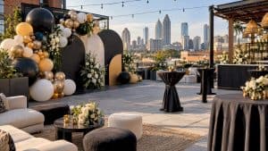
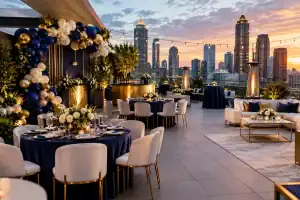
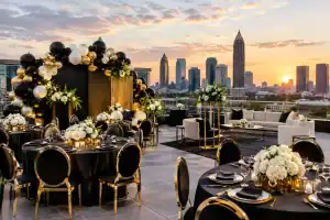
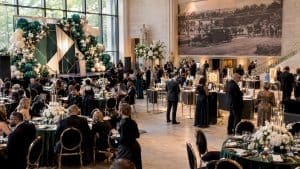
A beautiful event can still feel off if the color balance is wrong. You might have the right balloons, the right florals, the right rentals, and a stunning venue, but if every color is competing for attention, the final look loses its impact. That is exactly why planners and designers come back to one timeless principle: What Is the 60-30-10 Color Rule for Event Decor? It is a simple formula that helps a space feel polished, intentional, and seriously photo-ready.
At its core, the 60-30-10 rule is about proportion. Sixty percent of your event design should be your dominant color, 30 percent should be a secondary color, and 10 percent should be your accent color. It sounds basic, but when it is used well, it creates the kind of visual balance that makes an event feel elevated instead of chaotic.
What Is the 60-30-10 Color Rule for Event Decor?
The 60-30-10 color rule started in interior design, but it works beautifully in event styling because events need visual hierarchy just as much as homes do. Guests should be able to walk into a room and immediately feel the mood without being overwhelmed. A clear color ratio helps guide the eye.
Your dominant color, the 60 percent, usually sets the atmosphere. This is the shade that shows up most across the room. It might appear in linens, draping, balloon installs, table settings, lounge furniture, or backdrops. If you want the event to feel soft and romantic, this could be ivory, blush, or champagne. If you want bold and dramatic, it might be black, deep emerald, or crisp white with strong contrast.
The 30 percent color supports the main shade. It adds dimension and keeps the design from looking flat. Think of it as the stylish supporting role that gives your palette depth. In event decor, this often appears in florals, signage, select balloons, charger plates, candles, or specialty linens.
The final 10 percent is where the magic happens. This accent color is what gives the design that extra spark. Metallic gold, a pop of coral, glossy chrome, electric blue, or even a punchy hot pink can all work here. It should be used with intention, not everywhere. The accent is what creates those jaw-dropping moments without taking over the entire room.
Why this rule works so well at events
Event spaces are layered fast. You are dealing with tables, centerpieces, balloon garlands, stages, signage, photo moments, lighting, florals, desserts, and sometimes branded elements too. Without a system, it is easy for the design to drift into visual clutter.
The 60-30-10 rule keeps the room cohesive while still giving it personality. That matters even more when the event is meant to impress, whether it is a milestone birthday, a luxe baby shower, a graduation celebration, or a corporate launch. Guests may not know the formula, but they absolutely feel the difference.
It also photographs better. Cameras pick up imbalance fast. If every element is equally bold, nothing stands out. When one color leads, another supports, and a third adds contrast, photos feel cleaner and more editorial. For clients who want social-worthy decor, that is a big win.
How to apply the 60-30-10 rule in real event decor
The trick is not counting every object one by one. This rule is about visual weight, not math down to the inch. A giant balloon installation behind the dessert table may carry more visual power than ten smaller details across the room.
Start with the largest surfaces. Venue walls, draping, table linens, major balloon pieces, stage areas, and lounge setups usually determine your 60 percent. If the room already has strong built-in colors, those need to be considered too. A dark wood ballroom, a bright white studio, or a garden venue with a lot of greenery can all shift how your palette reads.
Next, identify the 30 percent color. This should complement the main color without fighting it. If your dominant color is soft beige, your secondary could be muted sage, dusty rose, or warm taupe. If your dominant shade is white, the secondary could be black, navy, or blush depending on the mood you want.
Then use your 10 percent color in the places where you want attention. This might be the metallic detailing on a custom backdrop, a few standout balloons in a garland, signature floral moments, napkins, menu cards, or a bold cake display. Accent color should feel deliberate. If it starts showing up everywhere, it stops being an accent.
What the 60-30-10 rule looks like by event type
For a luxury baby shower, your 60 percent might be cream or soft white across draping, table linens, and the main balloon install. Your 30 percent could be a dusty blue or blush used in florals and printed details. Your 10 percent might be gold in signage, pedestal styling, and cake accents. The result feels soft, elevated, and expensive.
For a graduation party, especially one with school colors, the balance gets more strategic. Let’s say the school colors are red and black, but the family wants the event to feel modern, not heavy. White might become the 60 percent, black the 30 percent, and red the 10 percent. That way the school identity is clear, but the room still feels clean and high-end rather than overly themed.
For a corporate event or brand activation, this rule is especially useful when brand colors are intense. A company may have orange, teal, and navy in its logo, but using all three equally in decor can be too loud. Instead, a neutral base can carry the 60 percent, one brand color can support at 30 percent, and the boldest brand shade can appear at 10 percent for impact. That creates a branded experience that still feels polished.
Where people get it wrong
The biggest mistake is treating all favorite colors as equal. Clients often love three or four shades and want each one to have a major moment. That usually leads to a design that feels busy instead of luxe.
Another common issue is using the brightest color as the dominant shade when it should really be the accent. Neon pink, vivid red, bright orange, and electric lime can be incredible in small doses. Used as the main color, they can take over the room fast and make the event feel less refined.
Metallics can also trip people up. Gold, silver, rose gold, and chrome are often treated like neutrals, but visually they behave more like accents. Too much metallic can flatten a design or make it feel overly shiny. A controlled touch of shimmer almost always lands better.
There is also the lighting factor. Colors shift under candles, uplighting, daylight, and flash photography. A palette that looks balanced in a mood board can feel completely different in the actual venue. That is why professional event design is never just about picking pretty swatches. It is about understanding how those tones perform in the room.
When you should break the rule
Like any design principle, this one is not a hard law. It is a framework. Some events benefit from a more monochromatic approach, where the design leans heavily on one color family with texture doing most of the work. Others need extra accent moments because the event is built around a bold brand identity or a highly stylized theme.
The key is knowing why you are bending the rule. If the choice is intentional, it can be stunning. If it is random, the room usually tells on you.
For example, an all-white event can still follow the spirit of the rule by using layers of ivory, cream, pearl, matte white, and reflective white, then bringing in a small metallic accent. A black-and-gold gala might push the accent beyond 10 percent because the drama is part of the experience. That can work beautifully if there is still a clear visual lead.
How professionals make the rule feel high-end
Luxury event decor is not just about expensive pieces. It is about restraint, contrast, and placement. The 60-30-10 rule works because it gives every design choice a role. Nothing feels random.
Designers also think beyond color alone. Finish matters. Texture matters. Scale matters. A matte balloon garland, glossy custom signage, velvet linen, acrylic plinths, soft florals, and candlelight can all live within the same color story but create a much richer result. That is what turns a nice palette into a full visual experience.
At the high end, the best event color stories also leave room for focal points. Maybe it is a custom photo backdrop, a sculptural balloon installation, a show-stopping sweetheart table, or a branded entrance moment that stops guests in their tracks. The 10 percent accent often plays a huge role there because it directs attention exactly where you want it.
For anyone planning an event that needs to feel elevated, the smartest move is not choosing more colors. It is choosing better proportions. Get the balance right, and everything else starts to look more intentional, more luxurious, and far more unforgettable.