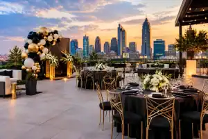
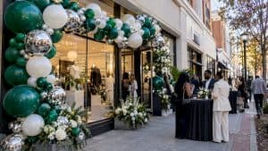
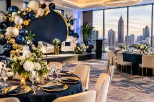
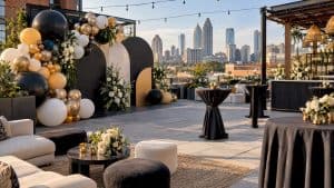
The fastest way to make an event look expensive is not adding more decor – it is choosing better color. If you have ever looked at a balloon setup and thought, this feels polished, custom, and camera-ready, the secret is usually the palette. Knowing how to choose balloon colors can take your event from basic party supplies to a full visual experience.
Color does more than fill space. It sets the mood, shapes the photos, and tells guests what kind of celebration they just walked into. Soft neutrals create a refined baby shower. Bold contrast brings energy to a brand launch. Rich jewel tones can make a birthday dinner feel elevated before the first guest even picks up a drink.
How to choose balloon colors starts with the event mood
Before you pick a single shade, decide what the event should feel like. Not the theme in a broad sense, but the actual emotional tone. Do you want playful, romantic, high-end, modern, dramatic, sweet, or full-on attention-grabbing? That answer matters more than people think.
A lot of clients start with a color they like, but that can lead to a palette that feels random in the room. A better approach is to start with mood, then build color around it. For a luxury birthday, matte black, white, and chrome gold can look sharp and editorial. For a first birthday, muted sage, sand, and cream feel soft and stylish without looking too babyish. For a corporate event, brand colors often need a second layer – neutrals, metallics, or tonal variations – so the setup feels designed rather than promotional.
This is where taste and strategy meet. The prettiest colors on their own are not always the right colors for your event.
Let the venue guide the palette
Balloon colors do not exist in a vacuum. They live inside a room, against walls, under lighting, beside florals, linens, signage, and people’s outfits. A palette that looks amazing in a bright white studio can fall flat in a dark ballroom. That is why one of the smartest ways to choose balloon colors is to look at the venue first.
If your venue already has a strong personality, work with it instead of fighting it. Warm wood floors, gold chandeliers, and cream walls usually pair beautifully with champagne, blush, terracotta, mocha, and soft ivory. A sleek modern venue with black fixtures and clean lines can handle crisper contrast like white, black, silver, emerald, or electric blue.
Outdoor events need extra thought. Natural light makes colors appear brighter and more open, while direct sun can wash out pale shades. If your event is in a garden or backyard, soft pastels can be gorgeous, but they need enough depth to hold their own against greenery and daylight. In bold sun, a palette with at least one grounding shade usually performs better in photos.
Lighting changes everything
This is the detail people skip, then regret. Ballroom uplighting can turn blush into peach, white into yellow, and pale blue into almost nothing. Evening events generally benefit from richer tones, especially if the room is dim. Daytime events can carry lighter shades more easily because the color has room to breathe.
If photos matter – and for most premium events, they do – test the palette mentally under the actual lighting conditions. A balloon installation should look striking in person and on camera.
Use a palette, not a pile of colors
One of the biggest mistakes in balloon decor is choosing too many unrelated colors. More color does not automatically create more impact. Usually, it creates visual noise.
The strongest installations tend to use three to five intentional shades. That range gives dimension without chaos. You want variation, but you also want control. A good palette often includes a main color, a supporting color, a lighter or darker tone for depth, and sometimes a metallic or neutral to sharpen the look.
For example, a baby shower palette might combine dusty blue, slate, cream, and a touch of chrome silver. A graduation setup could feature school colors softened with white and metallic accents so the display feels celebratory and elevated rather than flat. A romantic engagement party might use nude, blush, taupe, and pearl for that soft luxury look clients love.
When in doubt, use one statement shade and build around it. That keeps the design focused.
Match the colors to the occasion, but do not get trapped by tradition
There is nothing wrong with classic color cues. Pink for a girl’s birthday, blue for a boy’s shower, red and green for a holiday party – these pairings exist because they are familiar. But if you want a custom, higher-end result, it often helps to reinterpret tradition instead of copying it exactly.
A Valentine event does not have to be bright red. Wine, mauve, blush, and rose gold can feel more modern and far more luxe. A graduation celebration does not have to stop at school colors. Add black, white, or metallic layers and suddenly the whole setup looks like an event design, not a gym decoration.
For corporate work, sticking too rigidly to brand colors can also backfire. Some logos use shades that are hard to translate into a premium balloon palette on their own. The answer is not ignoring the brand. It is expanding it with tonal relatives and polished support colors that keep the identity intact while making the install look premium.
Popular luxury color directions by event type
Birthdays often look strongest with bold contrast or rich monochromatic color stories. Showers usually lean soft, tonal, and romantic. Corporate events tend to work best when branding is balanced with neutrals and clean structure. Proms, grads, and milestone celebrations can carry more drama, especially with black, metallics, jewel tones, or saturated pops.
The right choice depends on whether you want timeless, playful, or pure fire.
Think about who will be in the photos
Balloon decor is not just backdrop. It interacts with guests, outfits, skin tones, tablescapes, cakes, signage, and the entire visual rhythm of the event. If everyone will be dressed in all white for a birthday dinner, an all-white balloon installation may disappear. If the guest of honor is wearing a bright red gown, your palette should either complement that moment or intentionally stay out of the way.
This matters even more for branded activations and photo backdrops. If guests are stepping in front of the install for photos all night, the colors should frame people beautifully. Overly neon palettes can be fun in the right setting, but they do not flatter every event style. Soft matte finishes often photograph more elegantly than overly shiny or overly loud combinations.
A statement setup should command attention without stealing all the oxygen from the people it is meant to celebrate.
How to choose balloon colors with confidence
If you are still stuck, narrow your decisions through a simple filter. Choose one anchor color you know belongs. Then ask what should soften it, what should deepen it, and whether a metallic or neutral would finish it. That one exercise usually reveals a cleaner palette fast.
You can also start with an object already locked into the event, like the invitation, the floral plan, the cake design, the brand guide, or the room itself. Pulling balloon colors from something established creates cohesion, which is the difference between decor that feels added on and decor that feels fully produced.
This is also the moment to be honest about your risk level. If you love trend-driven color, go for it, but know that trendy palettes can date quickly. If you want something timeless in photos for years to come, neutrals, earth tones, tonal pastels, black and white, or jewel tones usually age better.
When custom advice makes the biggest difference
Some events are easy to color plan. Others are not. If your venue has mixed lighting, your brand colors are intense, your family has strong opinions, or you are trying to blend multiple themes into one cohesive look, expert styling saves time and prevents expensive guesswork.
That is where a design-driven team makes a real difference. A professionally chosen palette considers scale, room tone, lighting, texture, focal points, and photo impact all at once. It is not just about what colors are pretty. It is about what colors perform.
At the luxury level, balloon color selection is part creative direction and part event strategy. The best palettes feel effortless, but they are usually anything but accidental.
Great balloon decor does not start with a bag of random colors. It starts with a clear point of view. Choose shades that fit the mood, respect the venue, flatter the photos, and give your event its own visual signature – and the entire celebration will feel more elevated the second guests walk in.